Tuesday, 4 September 2012

Holiday snaps!

I've not added any photos recently so here are a few from the cruise I went on this summer! :)


La Coruna, Spain


The Medieval markets, La Coruna, Spain


    La Coruna, Spain


La Coruna, Spain 


The Guggenheim Museum, Bilbao.


Guernsey


Guernsey


Guernsey


La Rochelle


La Rochelle

Birthday Bunting!

Seeing as i am training to be an interior designer i thought it would be useful to put my sewing skills to practice! I recently celebrated my 21st birthday and so I'd made some bunting to hang up.

Here are the results!


Monday, 3 September 2012

Honours project - building plans

Here are some Auto CAD plans of the tower I got of the council's website.


These show the current owners' plans for an additional staircase on the outside of the building. I like the idea of this as it would create more space inside where the original staircase is now. This could also be glass if possible so that it would fit in with the potential glass extension.


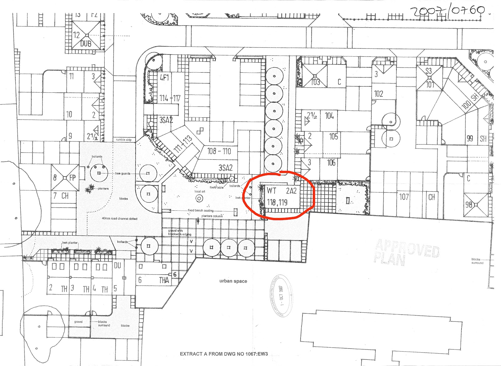
This plan shows the position of the water tower and where it is situated next to the nearby flats.


And a quick sketch i did of the tower....


Honours project - water inspired interiors

After looking into the history of the Hospital Water Tower I have been looking into interiors inspired by water. I want to incorporate something like this into my design to reflect the history of the building. These little touches will be a lasting reminder of the buildings character and story.
 
 
The glass works below reflect the fluidity and movement of water. The glass shows reflection and it's ripples show depth.


The room below, in the Roca London Gallery, has a ceiling which has a fluid like look to it. It's architect Zaha Hadid often likes to incorporate geology into her work. This particular building's design is inspired by the various phases and states of water. Water acts as the transformational element moving across the facade, carving out the interior and moving through the main gallery as individual drops.
Read more about the project at http://www.rocalondongallery.com/en/project


 I love these mirrors which resemble dripping water. They're really eye catching and interesting and would give a really dramatic look to a room.


This ceiling is fantastic! It's deep ridges, ripples and curves resemble waves and movement in the sea. These fabric sheets cleverly draw the eye to the beautiful sea views outside and sway with the help of the air conditioning!


And of course there are various water features that can be used inside or out. Or possibly from inside, heading out! The running water would be a constant feature of the building.


The water tower has a small amount of unused land at the side of it, after looking at glass works, i've looked into glass extensions. This would increase the amount of floor space on the ground floor and also create a different dimension to the building itself without distracting from its character and style. Here are some glass extensions that may be suitable.


I like these simple designs as they don't alter the building's style yet they create a lot more space.


Sunday, 2 September 2012

Boogazine - Semiotics and colour

One of the most important aspects in design is colour. Each colour provokes a different mood, feeling or memory. A colour on a wall can change the atmosphere inside it or alter an opinion.

The reason for this is semiotics. Semiotics are the study of signs, symbols and signification. It is how we create a meaning from certain communications for example signs or logos. These assumptions and conclusions that we make are all based on previous experiences via association. Colours evoke different memories or significations because we associate them with certain things. For example the colour red may remind of us love because we think of a love heart or a red rose. These are just automatic associations we make in our head but it is what defines each colour. Semiotics come into many other aspects in design such as branding; easily recognisable brands are those with familiar shapes or colours. For example the McDonald's M or the Cadburys sign.

Red
Red is a powerful colour, it can remind us of love and passion or on the other hand, blood, hell and fire.
This is why red should be used sparingly, hints of red would create a nice character and atmosphere to a room, for example, but too much could be overpowering.


Yellow
Yellow is a cheery colour, it reminds us of spring, summer and sun. It brings happiness and energy to a room.


Orange
Orange is said to decreases irritability and hostility and improve social behaviour. So good in a busy room. It brightens an area and is welcoming.


Green
Green is a fantastic colour for interior decorating because it is like the neutral colour. It is the most natural colour as it is everywhere in nature. It is a good balancing colour.


Blue
A primary colour, associated with such qualities as tranquillity, serenity and introspection. Popular in bathrooms due to its association with water.


Purple
Violet or purple is a regal colour, something we don’t see a lot of in interiors. It is mostly seen in the pale form of mauve or lilac. Also quite a relaxing and spiritual colour.


Pink
Pink is soft and subtle it is delicate, peaceful and gentle, but bold and vibrant shocking pink can be emotional and stimulating to your senses. It is essentially a very feminine colour.


Black
Black is a dramatic color, it provides the greatest contrast when teamed with white. It is a useful color to hide or camouflage things that you don’t want to highlight as it does not reflect light from it. It can be associated with sadness and death.


White
This is probably the most used color in interior design, mostly because it is neutral and goes with anything. It is a colour associated with purity and innocence and creates a great contrast with black.


Wednesday, 8 August 2012

Boogazine- psychology and web design

Design and psychology may not seem like an obvious link but there are so many areas to explore. One of these is website design. As with many things, first impressions are key. Often, when i search for something on google, if I open a site that looks unappealing, dull and full of small text, i won't bother even having a look and will go to the next link straight away. Other websites automatically catch your eye and draw you in. The position of icons and pictures can be very important as are colours and image quality.

Here are some examples of BAD website design


for me, this type of design has got to be the worst. There is no one thing that draws you in and the page has no sort of order to it. the text is very small and compact and the font is standard, but not very appealing. Images are very small and everything seems to be underlined. This site wouldn't interest me so i would look for another.


This site seems to be a bit of an overload of blue. its filled with lots of blue text that goes on for ages. Images are of a poor quality and there is a man awkwardly placed at the side of the screen talking about the site which could be quite off putting if you were trying to read- he has no pause button!


One thing this site can not be accused of is being dull!! however, I'm sure most people visiting this site would leave with a headache! The colours are way too overpowering and actually move around on the live site. There is a dove flying round the page, a cat running along the bottom and some crazy music in the background! I won't be returning...


Now for some GOOD examples!..

A good website is one that is easily accessible, easy to understand and to navigate around. Links and icons should be clear and tactically layed out. Images should be of good quality, eye catching and draw your attention in. It should want you to go back and visit it again or recommend it to a friend, It could be inspiring. It should sell the company or brand and allow the consumer to trust them. A point has been made that 'if a man from mars can not find the focal point of the page then it is not good enough' And overall it should meet the needs of the user.


 This website is clear, the text is large and legible. The excellent images are layed out neatly and there are menu options at the top so that you can choose what to look at or read and are not bombarded with information.


sorry about the quality of the images below, click to view the original


I really like these designs which use quirky characters on their site. It gives the page a bit of character and is interesting to look at. The colours used are very appealing and i thing these sites would be easy to use for anyone.


sorry about some image sizes! won't let me edit

Boogazine - Maslows hierarchy of needs.

I've not posted on my blog for a while as i have been away but today i've gone back to research for my Boogazine. I'm still interested in the idea of looking into how the world of psychology is so intertwined with design. Below is Abraham Maslow's Hierarchy of needs. Abraham Maslow was a professor who founded a major branch of psychology known as humanistic psychology, which examines very personal concepts like basic needs and self-actualisation. Humanistic psychology is widely used in marketing to truly understand the motives that drive a consumer to buy a specific product.


The idea with this pyramid is that the basic needs are at the bottom of the table and so they need to be met before progressing up the list. So for example, when buying a car the 'safety' section would usually be considered first for example; cost, how safe the car is going to be. Once this is sorted you can start to think about maybe the style and make (esteem/self actualisation).

So, in design it can often be more important to work out what it is that the customer wants from a product/ design and who they are as opposed to fully focusing on making the design look the best. A piece of furniture may be the most stunning piece of design you have seen but it may be too expensive, not the right size or too uncomfortable to even consider buying.


Read more at http://designshack.net/articles/business-articles/design-meets-psychology-putting-maslows-hierarchy-of-needs-to-work/#uSlwbo17Ic58gMI1.99