Saturday, 4 May 2013
Secton perspective drawings
Here are some brilliant Secton perspective drawings i have found on similar size or shape buildings to my honours building


Wednesday, 27 March 2013
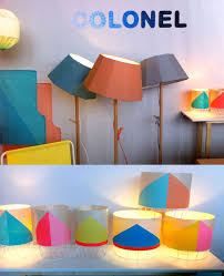
Brightly coloured shops
My first thought was to give the shop area of my building a vintage quirky style, but on second thoughts i would rather maintain the bright colours and fresh feel that run throughout the other floors. Here are some inspirational images...


I also like how this simple plan shows how colour is used throughout
Water inspired sculptures
Im thinking of having a sculpture running through two floors in my honours project. As it is a water tower, i think the sculpture should be inspired but the shapes and movement of water. Here are some similar sculptures


Wednesday, 20 March 2013
Space saving furniture!
A brilliant video on space saving furniture. Very inspirational for my Honors project which is a small building!
Sunday, 10 February 2013
Interactive flooring
The top floor in the building for my honours project will house a camera obscura. I want to create a 'shadow' on each floor as though the light from the camera has shone through the building...
So each floor will have a circle on the floor, or a hole in the floor
One idea for these circles is to have them as an interactive floor. Here are some examples of interactive floors...


So each floor will have a circle on the floor, or a hole in the floor
One idea for these circles is to have them as an interactive floor. Here are some examples of interactive floors...
or tables!..
Friday, 1 February 2013
'water figures'
Splashes of Colours, Water Figures by Linden Gledhill
These stunning images would provide great inspiration for water-inspired sculptures.
The kinetic wall
Whilst researching into ways of encorporating a water theme into my Honours project building i came across the 'kinetic wall'.
'The effect is created with 250,000 aluminum panels which are loosely suspended so as to move gently with the wind. The huge kinetic artwork captures the ever-changing movement of the wind in a graceful way that also happens to be naturally calming. Maybe the road rage that results from trying to fight your way out of a crowded parking garage will be lessened by the smoothly rippling panels that look eerily like a displaced lake.' (http://weburbanist.com/2010/07/23/another-wave-in-the-wall-vertical-lake-building-facade/)

It will also provide the car park with ventuilation and therefore cutting energy costs.

It will also provide the car park with ventuilation and therefore cutting energy costs.
Monday, 21 January 2013
Monday, 14 January 2013
Boogazine layout and colour scheme
I'm in the process of choosing a design and layout for my boogazine. I'm looking at some of my favourite brands and packaging for ideas as to what sort of colour to go for.


Benefit cosmetics
I like this packaging...
Other good colour combinations
This one is my favourite, i think this would be good with grey
As for the layout, because my boogazine is mainly based on retail i don't know whether to make it in the style of a retail magazine like this
or something like this which i came up with...
Subscribe to:
Comments (Atom)


