Tuesday, 26 June 2012

Public Attractions - Honours Project

As good as it was for me to be searching into derelict buildings, I needed a bit of an idea as to what i wanted to use the building for. I don't just want to decide on something that appeals to me, but to as many people as possible. So, i asked a number of people of different ages and living in different areas the following question;

 
If you could choose one public attraction/social area to be added to your local area what would it be?

 
I asked them to think of something they would possibly add within ten miles, to try and avoid duplication of other attractions we already have and for something not too big!

 
The results were as follows;


  • Cinema
  • Sports/leisure centre
  • Ice rink
  • Youth club
  • Outdoor gym
  • Water sports
  • Bowling alley
  • theme park
  • go karting

 
In conclusion, people tend to want somewhere where;


  • They can have fun
  • they can go with friends or family
  • perhaps somewhere they can exercise
  • exercise in a fun way
  • somewhere exciting
  • perhaps something different

 
I want my attraction to be something different, that we haven't quite seen before, something where people will travel to come and visit. Something that would be well known and talked about and that reflected or complimented the history of the building.


Here are some key features that need to be considered when choosing an attraction

  • location and key transport routes
  • annual opening schedule
  • prices and pricing structure, eg variations according to times of year/week/day
  • appeal of the attractions
  • additional facilities, eg shops, restaurants, hotels, child care facilities
  • number of visitors, eg day visitors, repeat visitors, staying visitors
  • facilities for customers with special need
  • importance of technology
  • possible funding sources, eg central/local government,
  • donations/gifts, entrance fees, membership fees, special events, sponsorship/corporate hospitality

    Also;
Different visitor types:
  • Individuals
  • groups, eg education, corporate, families
  • people of different ages, eg teenagers, grey market
  • overseas visitors
  • people with specific needs
Examples of how needs are met:
  • opening hours
  • facilities, eg creche, washrooms, eating places
  • pricing structure
  • access
  • audio guides in different languages
  • signage
  • information provision, eg Internet, information points, rangers


More to come as i research into visitor attractions.....


Monday, 25 June 2012

Building Research - Honours Project

I have started to look into derelict buildings in the area and their pros and cons for using them for my honours project.

Ormskirk water tower
Ormskirk is where I live, a market town in Lancashire. There are actually three old water towers in Ormskirk but this would be most suitable.


Pros
I think this is an ideal size,  5 small floors would be good as you could have something different on each floor. Good location- Ormskirk is a student town and often brings in visitors. Also it could do with something new in the town. Interesting architectural style. Local for me, for research.

Cons
Possibly each floor may be too small, depending on its use.

Scarth Hill Chapel
Also local, this Chapel has been derelict for as long as I can remember.

Pros
Excellent location- It is a couple of minutes drive away from the M58 and just a few minutes walk from Edge Hill University. Not too big and good grounds for and extension if needed.

Cons
Maybe too small. Design may be limited due to the building just mainly being one room. Possible changes needed on the actual building.


Winstanley Hall
Not as local, this Hall is located in Winstanley not far from Wigan. However, The remains Of the building, which was built in 1580 are actually located a few metres from my Aunties house.


Pros
Really interesting building and history. Good for access for me to do research

Cons
Too big, Slightly out the way, small town and hall is located in a forest. Building is very damaged, would potentially need a lot of work.


Extwistle Hall
This isn't in the area however the building is quite interesting and has a good story behind it. It was rumoured that people living in and around Extwistle Hall believed in raising the devil and other satanic rituals. It was owned by the Parker family for two hundred years until tragically, there was a Fire which badly damaged the building.


Pros
Interesting building, good size and layout. Located near to the Extwistle reservoir, another nice attraction. Some nice features to the building.

Cons
Very out of the way for me to access, building would potentially need work. possibly not the best area for a new attraction. I don't have much knowledge of the local area.


Honors Project Brief

Alongside my 'Boogazine' Project I will be doing an Honors project. Here is a short brief we have been given for Summer;

...............................................................

For the Honours Project in Semester 2 you will be changing an existing building or space chosen by you. An initial Site Analysis report will be prepared during Semester 1, culminating in a design brief for the project. Site options need to be approved by the teaching staff in the second week of Semester 1, before the Site Analysis begins.


The Design stage of the project is a sustained design project to alter an existing building or space to give it new meaning and/or a new use.  It can take some time to find the right site and to find information about it, so you are asked to start thinking now of possible sites.
To help guide you we will be working on the theme of Use - Disuse - Reuse

You will need to be make a short Powerpoint presentation of site options and possible projects in September.

 Initially this will be a vetting process to see if sites chosen are suitable. As well as your favoured option you should have two or three alternative options. Presentations should be simple; a few photographs and some key points about the site eg some history, why you think it’s good, what are the problems etc. Drawings are also useful, even your own sketches.


Some questions and points regarding site identification and analysis:

What is the potential for change?

Choose sites that have interesting qualities and offer potential for conversion, remodeling and reinventing. Although most sites are likely to be buildings it is not essential to have a traditional four-walled enclosure. A space that is partially enclosed but offers the possibility of full enclosure eg a railway arch or underpass, can make a very successful conversion project. It is also acceptable to take on smaller part of a larger building, eg an airport lounge, and remodel that in the context of the whole.

Where should the site be?

Your site can be anywhere, but bear in mind that you will be doing the project during term time. Once you are back in September it may not be easy to return home to get information, drawings etc. Sites in or near Preston are preferred but. It is appreciated that many of you don’t live near to the city so if you are opting for a site far away then you will need to do good preparatory work this summer.

What do I need to look for?

Things to consider might include: connection between inside and outside space, heights and volumes of internal space, quality of light, derelict spaces with potential, the history of the site and its context.

Beware of sites that are too big - You will need to judge in the first instance if a site presents too big a challenge. Large sites can be interesting and impressive but resolving circulation and planning issues may take a disproportionate amount of time. Smaller sites are often more interesting because you can deal with detail issues more easily

It is preferable if your site gives scope for variations in level eg multiple storeys, it makes for a more interesting project and gives you chance to demonstrate complex planning abilities.
What is needed for the start of the year?
Find a few possible options for sites and collect information in the form of photographs, sketches, notes and, if possible, drawings. Compile these into a simple Powerpoint presentation lasting no more than 3 minutes.

..............................................................

 
So, i am currently looking for a suitable building to transform and what to turn it into......

Wednesday, 20 June 2012

Sand dunes

A few images from a visit to the sand dunes in Birkdale.

click to enlarge.


Images edited on Photoshop using;
  • levels
  • black and white
  • brightness and contrast
  • blur tool
  • saturation
  • photo filters (warming filter, cooling filter)
  • colour levels

Tuesday, 19 June 2012

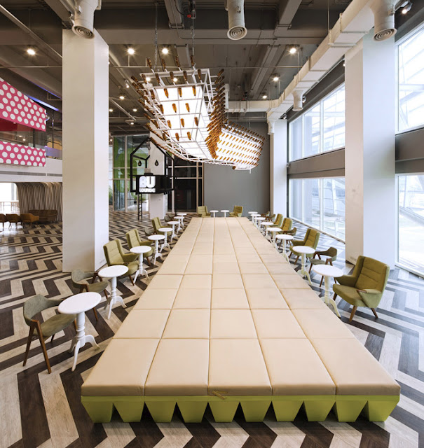
Bangkok University

Whilst here in England, we are facing increasing University tuition fees, In Bangkok, Thailand, University students are being treated to nothing but the best and with much lower fees! Bangkok have branded themselves a 'Creative university' and has been re designed, hoping that the outcome will encourage students to spend more time on campus. With today's technology it is easier to access information and assignments online without having to leave your own room and many students would rather be seen in city nightclubs as opposed to their student union bar. However, there is no doubt that this new 'lounge' will be the place to be seen. Its bright colours and eastern style design is like no other!


games zone


reading cave


panda spiral staircase


polka dot karaoke hut

other areas include 'gossip corner' and 'kung fu zone'!

Thursday, 14 June 2012

'lost in art'

As part of my boogazine research I'd also looked into photography. I came across the work of artist Lui Bolin who disguises himself and others into his photography using paint. He has many collections including 'the invisible man' and 'hiding in New York'. The hidden figures give the photographs a different dimension and create the illusion of transparency. You can see how much time and effort has gone into these works of art which makes them even more impressive. Here are some of my favourites.


The man in the last image above is Jean Paul Gaultier, getting 'lost in his own work'


Wednesday, 13 June 2012

Photos

My cousin's little girl got christened at the weekend. I just love this picture i took of her with her two Grandmothers and Great Grandmother


Boogazine

So, one of the things that i will be working on in my final year at uni is my Boogazine, here is a short brief we have been given to start our research over the summer;


Boogazine


In Semester 1 you will be required to produce a document called the “Boogazine”, a piece of research and critical enquiry in the form of a magazine. Significant emphasis should be given to visual material in the work.


You are required to propose an object that you wish to research and to take a particular critical position about that object. ‘Object’ in this context is something that exists, or has existed in historical time. It could be anything as long as it:


a.       connects directly to interior design/architecture and

b.      you can research it in depth in order to develop and sustain a line of critical enquiry.


It should be also be something that you personally find interesting. It can be a building or interior, but it could also be for example, a film, design movement, item of furniture, architectural style , designer, book etc.. Your Boogazine should aim to find something new to say about the object.


One of the ideas i have had is to look into Psychology in design and how the two work together which is often unnoticed. Here are a few things i could look into;


  • Familiarisation
  • Association
  • Subconscious
  • Subliminal messages
  • Colours
  • Emotional attachments
  • Memory triggers
  • Cultural preferences and differences
  • Designing for the situation (eg dentists-stressful-de stressing environment)
  • Environmental influences
  • Deception
  • Behaviour  or emotion changes due to a design.


This picture shows how the same room can be so different. Even though the structure of the walls and the size of the rooms are the same, you would experience each room differently simply because of things like different colours, position of objects, and how cluttered the space is.

Friday, 8 June 2012

Designer day care!

Wow! this Spanish day-care centre makes ours look really dull and drab. New parents Eva Luque and Alejandro Pascual designed the centre with their young children in mind. Even the colours in each room evoke different emotions amongst the children... blue is used in the baby room for relaxation, ages 1 to 2 benefit from orange­, a psychomotor stimulator; and the oldest get green to evoke nature!


Cushions

Check out mine and mum's cushions we made to brighten up the spare room!


Thursday, 7 June 2012

GREAT Britain!

With Just having celebrated the Queen's Diamond Jubilee and the Olympics just round the corner, the high street has been bombarded with red, white and blue. Its not just about picking up a flag or themed umberella for only a pound but the british flag can be seen on the interiors scene too! Our designers are proud to be british!..


3d bed linen!


John Lewis


Amazon


apollo blinds


jan constantine


House of Fraser


Stamp Rugs


Dwell


Balloon Desk

I just love this desk by Rory Hamilton, creative partner at Dublin design agency Boys and Girls. After a cover story by Marketing magazine that described their office as just "small and routine" this desk was created to give a more fun and original look to the place.
Taking us back to our childhood, it appears that the desk is carefully balanced on a stack of over sized Jenga blocks whilst the other side is being lifted by several helium balloons.