
Monday 21 January 2013
Monday 14 January 2013
Boogazine layout and colour scheme
I'm in the process of choosing a design and layout for my boogazine. I'm looking at some of my favourite brands and packaging for ideas as to what sort of colour to go for.


Benefit cosmetics


I like this packaging...

Other good colour combinations

This one is my favourite, i think this would be good with grey
As for the layout, because my boogazine is mainly based on retail i don't know whether to make it in the style of a retail magazine like this
or something like this which i came up with...

Friday 11 January 2013
Damien Hirst's Brit award design!


After much anticipation, Damien Hirst has released his designs for the 2013 Brit award. The award features his famous spot motif from which he designed, and more famously did not paint, 1,400 paintings. In true Hirst style the design is simple and didn't take him very long to come up with!


Above are some of the spot paintings from which Hirst has modelled the award. He is very controversially know for only painting 5 of the 1400 paintings because he couldn't be bothered! and so the remainder are done by assistants.
Last years Brit award was designed by Sir Peter Blake and 2011's by Vivienne Westwood.

Sir Peter Blakes design, quite relevant in 2012 for the year of the Queens Jubilee and the London Olympics.

The stunning and elegant Westwood design featuring the words 'Stop! climate change' on the bottom.

Of course these came after the classic design, used last in 2010
Wednesday 2 January 2013
Materiality and Fabrication
I've been looking at different materials i can consider using for my future life project. The 'hub' will be this sort of shape;

One way of constructing my future life ‘hub’ would be to use a metal framework. Almost like a wire mesh.


One way of constructing my future life ‘hub’ would be to use a metal framework. Almost like a wire mesh.
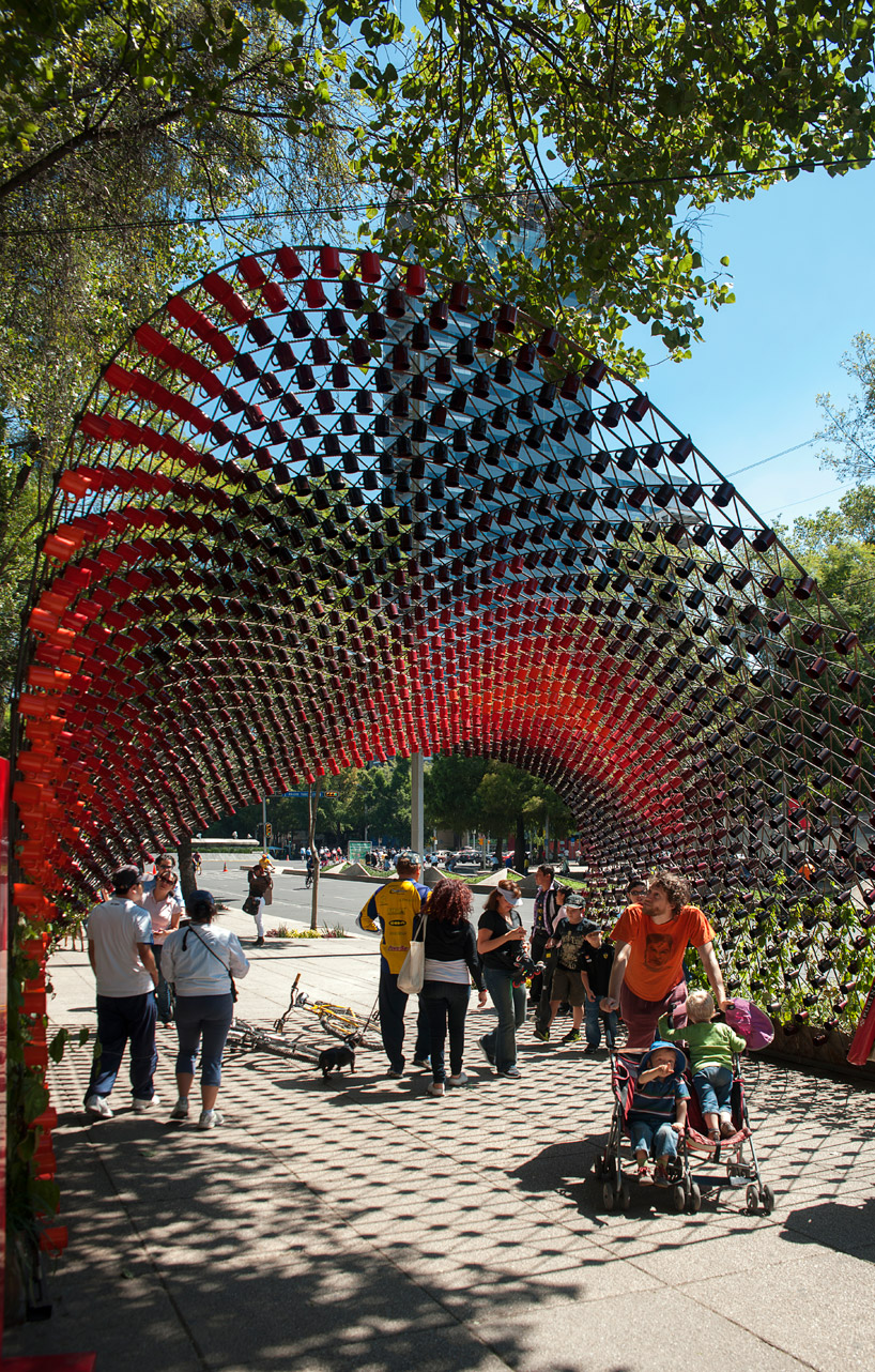
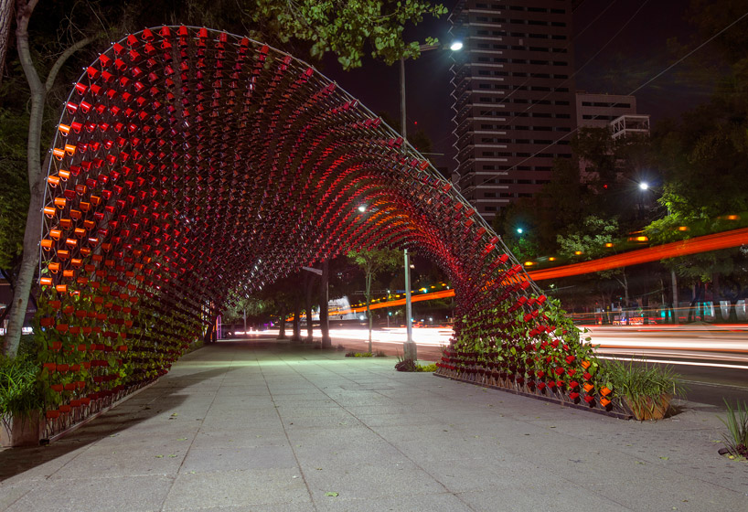
Located in Mexico City, this structure by rojkind arquitectos called 'portal
of awareness' uses a simple wire frame fixed to the ground.
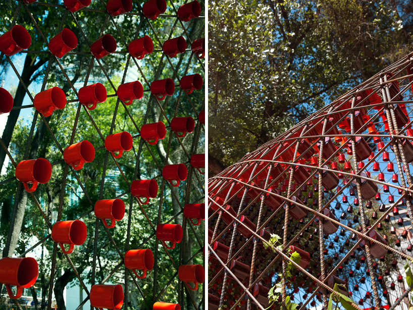
The structure was commissioned by Nescafe and includes 1497 coffee mugs in different shades of red hanging from the framework. The unusual shape and varied shades of colour provide add a sense of movement whilst travelling through it.
The greenery will eventually grow to cover the entire structure
The framework is made up of several steel rods crossing over one another, anchored at both sides by steel planters. The rebar (reinforcing bar) is used to fashion a lattice of arches that vary in length from 10 to 12 metres.
This type of construction is really strong and seems to work for this sort of curved shape however it may or may not be ideal for my structure as mine would have a suspended 'hood' or roof in the middle which wouldn't allow anchorage at both sides.
Subscribe to:
Posts (Atom)